A System Dynamics Primer - Drawing Causal Loops
In system dynamics, causal loop diagrams are a way to:
Identify system components and set model boundaries;
Identify positive and negative relationships between pairs of system components;
Identify the prevailing dynamics of each loop in a modeled system (balancing or reinforcing);
Provide a basis for creating a computer model that can run simulations to identify the right leverage points.
In this article, we’ll draw some causal loop diagrams to show how they work. I encourage you to pick up pen and paper and draw your own as you read!
Important note: In a real-world exercise, you’d bring stakeholders together for extensive discussions to identify system components and relationships. This would likely be the most time-consuming part of the exercise: for a highly complex system, it could take months!
Another important note: The goal of drawing a causal loop diagram is not to diagram the entire system! It’s to create a usable tool to identify leverage points. So, a major goal of the diagramming process is to set boundaries for the model and hone in on the key system components and loops. There’s a significant risk that unless sufficiently diverse perspectives are involved in creating the diagram, key loops will be left out, and you’ll overlook key leverage points.
So, don’t think that bringing only managers to the table is likely to work well. If warehouse employees are stakeholders, bring them to the table. If suppliers are stakeholders, bring supplier reps to the table. Fight the tendency to get trapped in a perspective echo chamber of similar viewpoints.
So, let’s dive in. I’ll use CPI (the consumer price index) as an example, since it’s in the news today.
CPI is a pretty big “system”. Isn’t this all about boundaries?
Yes, and we’re not going to diagram every component feeding into CPI. This is just a simple example. But you’ll see how to draw causal loop diagrams, and how to assess their components as pairs and then overall.
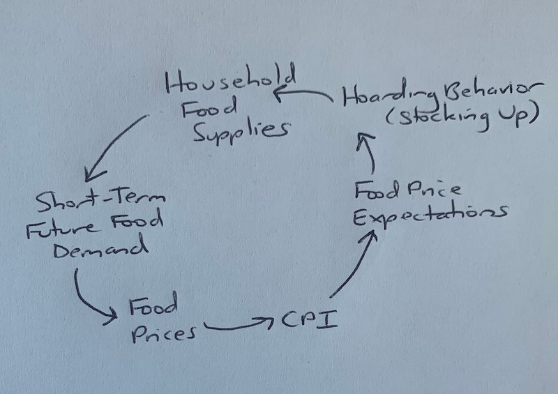
I’ll start by drawing a simple closed loop for how CPI affects food price expectations and resulting consumer behavior. Remember, I’m abstracting a bit, not showing every detail of the cycle:
What this diagram says is: CPI affects food price expectations, food price expectations affect hoarding behavior, hoarding behavior affects household food supplies, and so on around the loop until food prices affect (serve as an input to) CPI.
But how do these components affect each other? It’s tempting to travel all the way around the loop and think through it like this: “If CPI increases, then food price expectations also likely increases, which will increase hoarding behavior, which will….”
Stop. Don’t do this first. In a complex loop, the likelihood of mistakes increases with each link in the chain.
Instead, assess each pair individually and determine if the relationship between the two components is positive or negative. Like this:
“If CPI increases, then food price expectations also likely increase. And if CPI decreases, then food price expectations also likely decrease.”
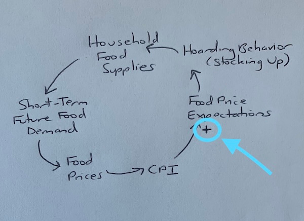
That’s a positive relationship, because the two components tend to move in the same direction, all else held constant. Other factors external to our loop can affect the outcome, but if we just consider these two components in isolation, their relationship is positive. So, we draw a plus sign beside the end of the arrow near Food Price Expectations. On our diagram, it looks like this:
When you see a plus sign in a system dynamics diagram, read it as, “These two components move together, considered in isolation.”
Is this like ceteris paribus in economics?
Yep. With other conditions remaining the same, what’s the relationship of each pair of components? On to the next part of the loop:
“If food price expectations increase, then hoarding behavior also likely increases” (because people want to stock up now while prices are lower).
“If hoarding behavior increases, then household food supplies also likely increase.”
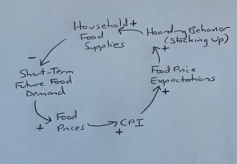
“If household food supplies increase, then short-term future food demand likely decreases.” That’s interesting. The relationship between these two components is negative, not positive. They move in opposite directions. They have an inverse relationship. So, we draw a minus sign beside the end of the arrow near Short-Term Future Food Demand.
Onward: “If short-term future food demand increases, then food prices also likely increase” (with a delay for manufacturers and grocers to adjust). Again, remember this is in isolation! There are other factors affecting food prices beyond this simple closed loop, including supply chain bottlenecks, crop shortages, and so on.
“If food prices increase, then CPI also likely increases” (Again, in isolation! CPI has a ton of inputs that we’re not considering yet.)
At this point, we’ve gone around our loop, identifying the isolated positive and negative relationships between each pair of components, and our loop looks like this:
Okay, now what?
We need to consider the prevailing dynamics of the loop as a whole.
Now is the right time to travel all the way around the loop and think through it. As John Sterman puts it in the book Business Dynamics, we’ll “trace the effect of a change around the loop.” (There’s a neat trick for checking our results afterward, too!)
We can start at any point on the loop and return to that same point. We’ll start with an assumption that food price expectations increase and then travel around the loop from there:
“If food price expectations increase, then hoarding behavior (stocking up) likely increases, which will likely increase household food supplies, which will likely decrease short-term future food demand, which will likely decrease food prices (after a delay for market adjustment), which will likely decrease CPI (after another delay for data collection), which will likely decrease food price expectations.”
Hold on. We changed direction. We started out with an increase in food price expectations and arrived back around with a decrease in food price expectations. If we go around again, continuing to follow our chain, we’ll change direction again:
“If food price expectations decrease, then hoarding behavior likely decreases, which will likely decrease household food supplies, which will likely increase short-term future food demand, which will likely increase food prices (after a delay for market adjustment), which will likely increase CPI (after another delay for data collection), which will likely increase food price expectations.”
This loop flips back and forth. It’s a balancing loop (aka a negative loop). It isn’t feeding some vicious spiral of price inflation or deflation. Yes, an exogenous (external) shock like massive crop destruction could cause such a spiral… but that would be a different loop, and it would connect to this loop at the point where it affected food prices. It might also dominate this loop, sending food prices and therefore CPI spiking despite the balancing nature of this loop in isolation.
You mentioned a neat trick for double-checking the loop polarity.
Sure thing. This is a shortcut, and you shouldn’t use it alone. But it’s a good double-check if you’ve already traced the effect of a change through a loop.
Here’s how you do it: in the loop, count the number of negative signs. In our example, that’s one. (Remember, we assessed the relationship between each pair of components individually.) Because we have an odd number of negative signs, our loop is a balancing loop. It tends to return a system to a goal state. In Business Dynamics, balancing loops are described as “goal-seeking”.
On the other hand, if we had a zero or even number of negative signs, then the loop would be a reinforcing loop. Reinforcing loops (aka positive loops) tend to produce exponential growth or decay.
This trick can help you make sure that in tracing a change through an entire loop, you didn’t slip up somewhere. If there’s a discrepancy between the sign-counting shortcut and your change-tracing, trace the change again. Then trace another change, starting elsewhere in the loop. Sometimes it helps to talk it through out loud. Applying both thought processes increases the chance of accuracy in identifying loops correctly.
How complex can these loop diagrams get?
Very. Complex systems are composed of many balancing and reinforcing loops, all working simultaneously to produce outcomes.
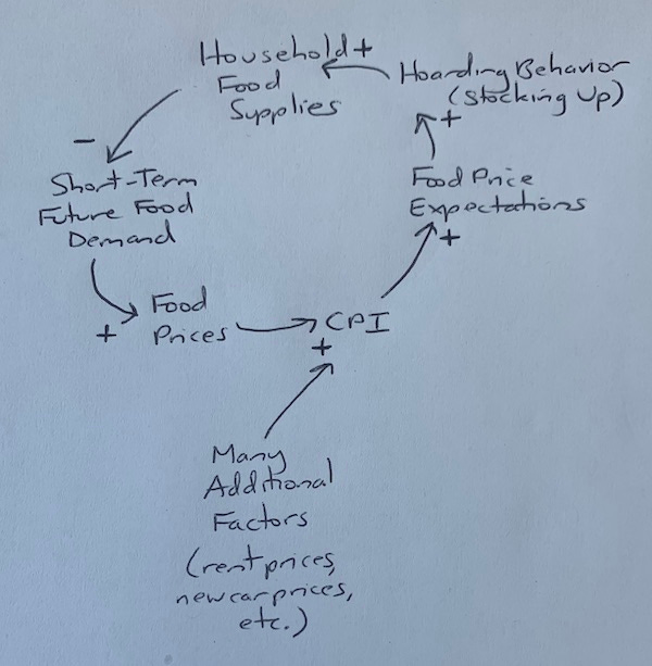
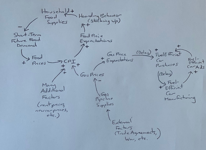
For example, of course there are other factors affecting CPI, and we can draw them here as exogenous (external to our loop) influences:
We can even dig into some of them. Let’s take gas prices. We might draw something like this (Important: this is a rough and limited example. In the real world, you would draw many more flows and loops based on detailed stakeholder interviews!):
Look at the Fuel Efficient Cars loop. There are zero negative signs in that loop, which leads us to believe it’s a reinforcing loop. Does the logic pan out?
“If fuel-efficient car purchases increase, then (after a delay, which can lead to oscillations) fuel-efficient car manufacturing increases, which increases the amount of advertising for fuel-efficient cars, which increases fuel-efficient car purchases, which (after a delay) increases fuel-efficient car manufacturing….”
Yep. This is a reinforcing loop.
I feel exhausted.
The good news is that once you get into a system dynamics mindset, modern computing makes it easier to create diagrams and run back-end simulations in huge quantities. But, as always, getting the model and initial parameters right is key.
Takeaways and important questions:
Where should we set the model boundaries?
What stakeholder perspectives have we not included in interviews, and what might we be missing? Should we interview those stakeholders now to save re-work later and avoid skewed conclusions?
What leverage points should we aim to influence first, based on what the simulation output is telling us (and not based on intuition, conventional wisdom aka “we’ve always done it this way”, or zeitgeist trends)?
System dynamics models can help predict behavior, identify leverage points, and adjust policy and action levers in new and different ways. Is “maximize GDP” always the right goal at a societal level? System dynamics has the power to tell us, if we’re willing to dig in, do the work, and then act on it.
-<>-<>-<>-
Extra, Extra!
Three links from the depths of my bookmark archives; think of these as tangential extras for curious readers:
1. 2022 International System Dynamics Conference - virtual and in Frankfurt - July 18-22 (there were some online workshops on July 12, too).
2. The Norwegian prison where inmates are treated like people - by Erwin James in The Guardian - an example of a counterintuitive leverage point in action.
3. Introduction to System Dynamics Modeling - by Leonard Malczynski - short course on quantitative modeling with system dynamics using PowerSim software.


